My dream of a container image format: a call to the web community
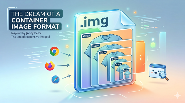
A single image file bundling every resolution could finally make the `<img>` tag simple again. A call to the web community to build a container image format.
Making the web faster and more user-friendly
A single image file bundling every resolution could finally make the `<img>` tag simple again. A call to the web community to build a container image format.

To avoid layout shifting and optimize for the Cumulative Layout Shift (CLS) Web Vital in you web pages, you need to reserve space for any content that might be rendered later in time. This is the case for images, videos and any asynchonously loaded content (e.g with AJAX calls). Here's a new way to do it.

On June 24th, 2022 I spoke about how to automate responsive images optimisation at the LazyLoad Conference 2022. Here's the video of my talk.
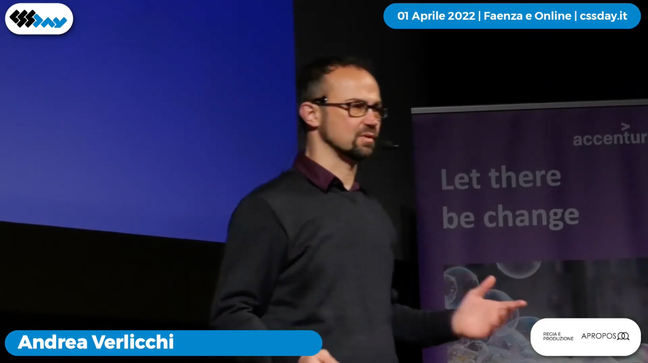
On April 1st 2022 I spoke about responsive images optimisation 4.0 at the CSS Day Conference 2022 in Faenza, Italy. This talk – in Italian language – is on how to become more productive by automating responsive images.
Say you have multiple carousels in a page, each one containing multiple images, and you want to download only the images that are inside the visible portion of the page, and maybe save some CPU time by lazily create the carousel instances. I think I’ve found a valuable and elegant technique to do so.
Before the day Safari started to support WebP images, we were forced to use the picture tag to serve WebP images to browsers supporting it. Today all modern browsers support WebP, so there's probably a clever way to do that using a single tag, img.

With the rise of very high density “super retina” displays in the newest high-end devices, capping image fidelity to 2x leads to a big improvement in terms of rendering speed, and no perceivable quality loss for your users. Here’s a new best practice on how to do that.

Do you want to boost performance on your website? You can do that by using **responsive images and lazy loading! In this article, you will find the HTML, JavaScript, and CSS code to lazy load responsive images, to make browsers use modern image formats like WebP and Jpeg2000, and to enable native lazy load where supported.

On April 6th 2019, Addy Osmany wrote about native image lazy-loading. Two days later Yvain, a front-end developer from Paris, asked me if my vanilla-lazyload could be a loading attribute polyfill, inspiring me to develop and release version 12 of my script, which features a new use_native option to enable native lazy-loading where supported. You can already use it today.
In the latest years, both at my job and as maintainer of a LazyLoad script, I've specialized in lazy loading of responsive images. Today I'm going to show you what HTML, CSS and JavaScript code you need to write in 2019 in order to serve responsive images and load them lazily.
It's official. Responsive images are a W3C recommendation since November 2016, featuring the brand new picture tag and new attributes for the img tag: srcset and sizes
Say you have a responsive website layout where images are sized at 100% of the container, but the container is not always as wide as the viewport. Do we need to use the picture tag, or the img tag is enough?
It's now possible to have lazy loading on responsive images to make our images to adapt to users screens and keep our website fast. In this article, we'll see what markup we need to write and which Javascript libraries we're gonna need to do that.
See all tags.