My dream of a container image format: a call to the web community
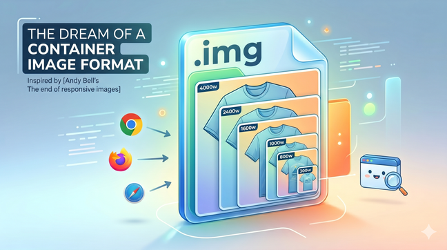
A single image file bundling every resolution could finally make the `<img>` tag simple again. A call to the web community to build a container image format.
Making the web faster and more user-friendly
A single image file bundling every resolution could finally make the `<img>` tag simple again. A call to the web community to build a container image format.

To avoid layout shifting and optimize for the Cumulative Layout Shift (CLS) Web Vital in you web pages, you need to reserve space for any content that might be rendered later in time. This is the case for images, videos and any asynchonously loaded content (e.g with AJAX calls). Here's a new way to do it.

On June 24th, 2022 I spoke about how to automate responsive images optimisation at the LazyLoad Conference 2022. Here's the video of my talk.
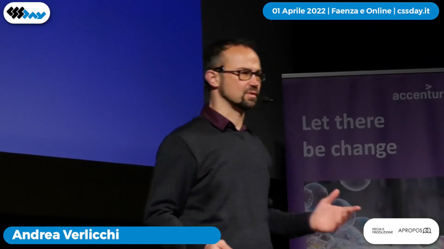
On April 1st 2022 I spoke about responsive images optimisation 4.0 at the CSS Day Conference 2022 in Faenza, Italy. This talk – in Italian language – is on how to become more productive by automating responsive images.
In the latest years, both at my job and as maintainer of a LazyLoad script, I've specialized in lazy loading of responsive images. Today I'm going to show you what HTML, CSS and JavaScript code you need to write in 2019 in order to serve responsive images and load them lazily.
It's official. Responsive images are a W3C recommendation since November 2016, featuring the brand new picture tag and new attributes for the img tag: srcset and sizes
Say you have a responsive website layout where images are sized at 100% of the container, but the container is not always as wide as the viewport. Do we need to use the picture tag, or the img tag is enough?
See all tags.