Andrea Verlicchi

Making the web faster and more user-friendly

Tagged “techniques”

  1. An elegant technique to lazyload images in Swiper, and lazily create Swiper instances

    Say you have multiple carousels in a page, each one containing multiple images, and you want to download only the images that are inside the visible portion of the page, and maybe save some CPU time by lazily create the carousel instances. I think I’ve found a valuable and elegant technique to do so.
    Read more →
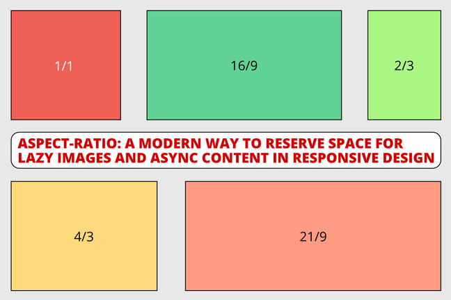
  2. aspect-ratio: A modern way to reserve space for images and async content in responsive design

    To avoid layout shifting and optimize for the Cumulative Layout Shift (CLS) Web Vital in you web pages, you need to reserve space for any content that might be rendered later in time. This is the case for images, videos and any asynchonously loaded content (e.g with AJAX calls). Here's a new way to do it.

    Read more →
  3. A clever way to serve WebP images to modern browsers and JPG to IE

    Before the day Safari started to support WebP images, we were forced to use the picture tag to serve WebP images to browsers supporting it. Today all modern browsers support WebP, so there's probably a clever way to do that using a single tag, img.

    Read more →
  4. How to cap image fidelity to 2x and save 45% image weight on high-end mobile phones

    With the rise of very high density “super retina” displays in the newest high-end devices, capping image fidelity to 2x leads to a big improvement in terms of rendering speed, and no perceivable quality loss for your users. Here’s a new best practice on how to do that.

    Read more →
  5. How to optimise for CLS when loading more content asynchronously

    Cumulative Layout Shift (CLS) is an important, user-centric metric for measuring visual stability because it helps quantify how often users experience unexpected layout shifts — a low CLS helps ensure that the page is delightful.

    Read more →
  6. Lazy load responsive images in 2020

    Do you want to boost performance on your website? You can do that by using **responsive images and lazy loading! In this article, you will find the HTML, JavaScript, and CSS code to lazy load responsive images, to make browsers use modern image formats like WebP and Jpeg2000, and to enable native lazy load where supported.

    Read more →
  7. Critical CSS with Jekyll and SASS

    My blog used to be run by Jekyll on GitHub pages and its CSS was built using SASS. Today I decided to boost performance even more inlining the render-blocking critical CSS, but even searching the internet I struggled to find an easy way to do it. This post is for you, in case you want to do the same.

    Read more →
  8. Web Share API, the step after PWA

    Today I experimented with the Web Share API and implemented it on this website, just to begin. Here's what I did and how you can implement it on your website.

    Read more →
  9. Making my blog a Progressive Web Application

    Some of my workmates and I took part to a Google Hackathon about Progressive Web Application and we learned a lot, so I've decided to enable this website as a PWA. Here's what I did.

    Read more →
  10. A smashing article on hybrid lazy loading

    On May 6th, 2019 I wrote my first article on Smashing Magazine: Hybrid Lazy Loading, A Progressive Migration To Native Lazy Loading.

    Read more →
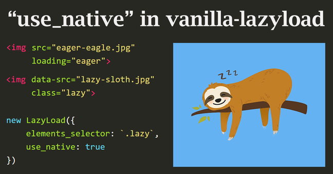
  11. Native lazy loading and js-based fallback with vanilla-lazyload 12

    On April 6th 2019, Addy Osmany wrote about native image lazy-loading. Two days later Yvain, a front-end developer from Paris, asked me if my vanilla-lazyload could be a loading attribute polyfill, inspiring me to develop and release version 12 of my script, which features a new use_native option to enable native lazy-loading where supported. You can already use it today.

    Read more →
  12. Responsive and accessible table design

    How to make a potentially wide table fit on small devices, without losing readability and accessibility? Here are simple solutions to make tables look like lists, lists look like tables, in responsive and accessible design.

    Read more →
  13. Lazy load responsive images in 2019

    In the latest years, both at my job and as maintainer of a LazyLoad script, I've specialized in lazy loading of responsive images. Today I'm going to show you what HTML, CSS and JavaScript code you need to write in 2019 in order to serve responsive images and load them lazily.

    Read more →
  14. Check if an element is still inside viewport after a given time

    What would you do if somebody asked you to load a DOM element only if it stays inside the viewport for a given time? You would use vanilla-lazyload, wouldn't you?

    Read more →
  15. Intersection Observer and lazy loading of elements

    In August 2017 the Intersection Observer API, a new exciting browser API, finally gained quite wide support. We can use it to know when two DOM elements intersect, or when a given DOM element enters the browser viewport. The lazy loading of images is just the case.

    Read more →
  16. Using CSS variables as a spacing unit

    Here I show you how you can CSS variables, popular name of CSS custom properties, to scale your layout spaces across different media queries.

    Read more →
  17. Changing text color for contrast based on background lightness

    If you had to change the color of some fixed-positioned text based on the lightness of its scrolling background, how would you do that? CSS filters, blend modes? But what if you had to support all browsers, including Internet Explorer? Here are a couple of ways to do that using CSS clip and clip-path.

    Read more →
  18. Responsive images, an HTML 5.1 standard

    It's official. Responsive images are a W3C recommendation since November 2016, featuring the brand new picture tag and new attributes for the img tag: srcset and sizes

    Read more →
  19. Responsive images? You don't need the picture tag

    Say you have a responsive website layout where images are sized at 100% of the container, but the container is not always as wide as the viewport. Do we need to use the picture tag, or the img tag is enough?

    Read more →
  20. Lazy load of responsive images with srcset and LazyLoad

    It's now possible to have lazy loading on responsive images to make our images to adapt to users screens and keep our website fast. In this article, we'll see what markup we need to write and which Javascript libraries we're gonna need to do that.

    Read more →

See all tags.